Distraction-free learning for
Gen Z
AcademU is an online learning platform focused on providing its users with distraction-discouragement and live-chat/coaching features.
Background
Introduction
Learning online has been dominated by Universities and long-form video lecture packages for most of the industry's lifetime. People who have very busy and plan centric lifestyles also deserve the chance to skill up. Identifying who and why these people face challenges in this sect is key.
Project goals
The platform must provide students with options to assist with focused learning.
Give the students an avenue to contact professionals to prevent progress stagnation
Completion time
4-month project completion

My role
Solo designer and researcher
Tools
The Solution
By collecting data and identifying trends in the online learning market, I designed an application that aims to improve user focus and drive up graduate numbers.


Affordable bites of full size courses available
Accessible by lower income individuals
Open tutor base means the quality control is lower
Research Objectives
Research
1. Identify and understand the demographic for our educational tool
2. Understand how people will comfortably use our service
3. Identify ways to retain users
4. Determine what attaining skill proficiency means to the user
Secondary Research
There is a wide spectrum of products in the online learning space, and we needed to determine what aligns with AcademU’s project goals and what trends are successful in the design space.
Provides university level education for career specific courses
Allows businesses to sign up their employees
Very busy homepage
Learn any skill, be it mundane or intricate
Pushed by influencers and has the largest community
Price of entry is the main barrier

Notable professionals as their tutors and branding
Masterclass looks high-class and expensive in its design
Trial is not available
Which of these settings are more engaging for you as a learner?
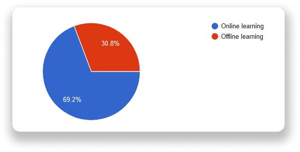
Online learning is more engaging since you are not time constrained and can progress at your own pace. You can also rewind.
When learning offline, it can often feel impersonal to me, which can hurt my concentration and absorption of what I am trying to learn
Offline learning makes me more involved in the process, you get to meet face-to-face with your tutors and classmates, and it's easier to discuss topics than being a virtual presence.
It's easy to get distracted online by many things and not engage well. In person, I find it is more engaging being in the room and able to see others participating in learning also.
Being able to access material at any time and learn at my own pace is helpful.
Primary Research
Primary research was conducted between user surveys and interviews.
I interviewed 5 potential learners.
I received 13 responses to my survey.
Survey Results
Out of 13 responses to my 10 questions, here are some of the replies that influenced our design decisions:
Which of these learning platforms do you prefer to use?
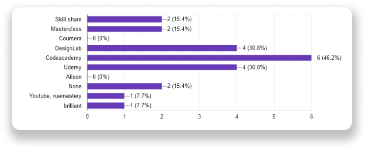
YouTube is my primary platform since it has all the basics for a certain topic and is usually most up to date. For more advanced knowledge, I use the paid platforms
Codecademy and Udemy are great for picking up new programming languages, very intuitive and simple to follow. No crazy bloat.
Regular course flash sales, so a great place to pick up courses. The interface is also really well laid out.
I use this because I am a student in Computer Science, and it helps me with tasks
Hands-on lab work is the best way to learn
Mapping Our Results
What challenges do you face when learning with an online source?
Knowing if you are in the right track
Online sources can easily become overcomplicated and oversaturated with information very quickly. Without giving enough time for or re-intensifying certain aspects to be understood, it can be easy for people to get lost.
Sometimes I may not understand something and would have to go out of my way to research into it to understand what is being explained etc....
Finding time and motivation to commit to it without a schedule.
Motivation is usually difficult to keep and building a habit to stick to
Distractions at home (kids).. and lack of concentration/motivation
Here is some placeholder text for this section, as I don’t want to think about it too much until I come back to the portfolio at a later date
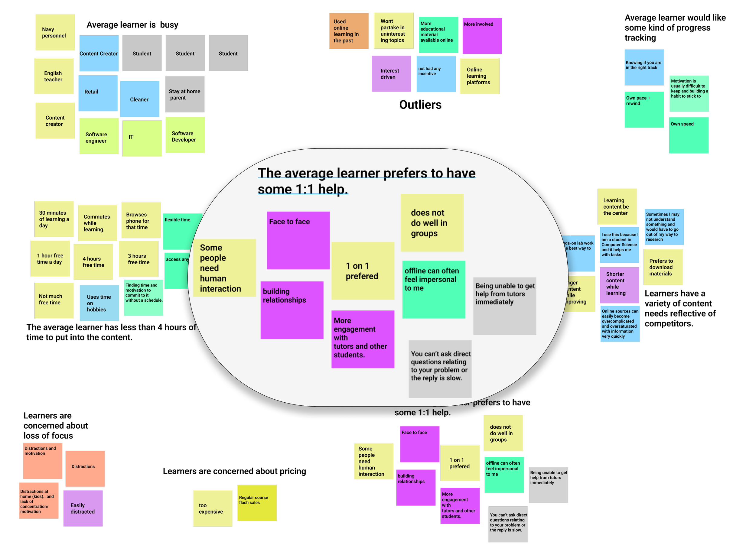
From the map above, we can deduce that learners, on average, are busy people who like to pick out the content they want to learn from a wide selection and are concerned about pricing and focus.
With this knowledge, we can move into defining a persona and craft objectives and goals around them.
Personas
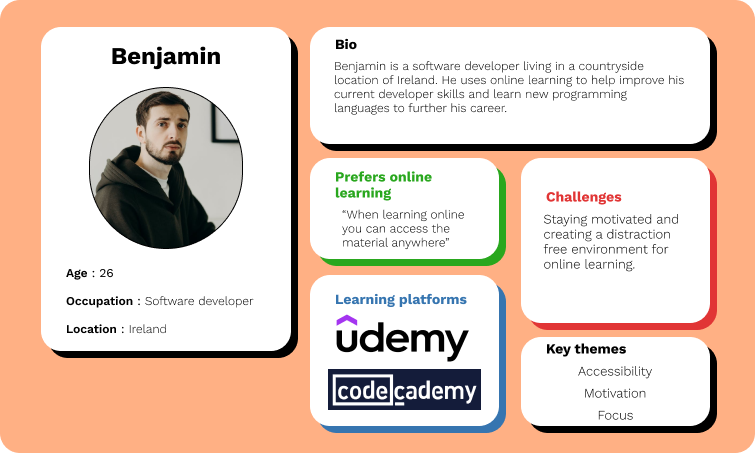
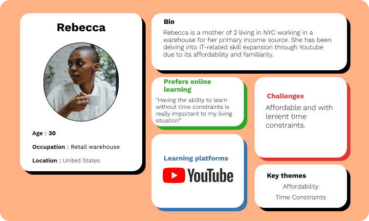
Two personas were created to capture the needs of two potential learners based on the research above, what their current learning platforms are and their circumstances.
We have:
Rebecca - A busy mother living in the big city using a free learning platform
Benjamin - A software developer based in the countryside using a career-specific learning platform and a paid platform
Point Of View Statements
★ I would like to explore ways to help Low income, enthusiastic learners to take part in online learning because they most likely do not wish to use their income on something they will not know they need.
★ I would like to improve the online learning space for easily distracted learners to achieve a distraction-free learning experience because of the need to study without subconscious distractions like social media.
★ I would like to explore ways to assist easily overwhelmed learners to stay on top of their coursework and keep on track because they may be stuck on problems or lose track of their progress.
Hover over the image to reveal
How Might We Questions
➢ How might we help low income users feel more confident in their course purchase?
➢ How might we limit distractions for easily distracted users as an online platform?
➢ How might we help overwhelmed learners stay on track with their course?
➢ How might we assist those who want to learn online but need 3rd assistance when stuck?
The Vision
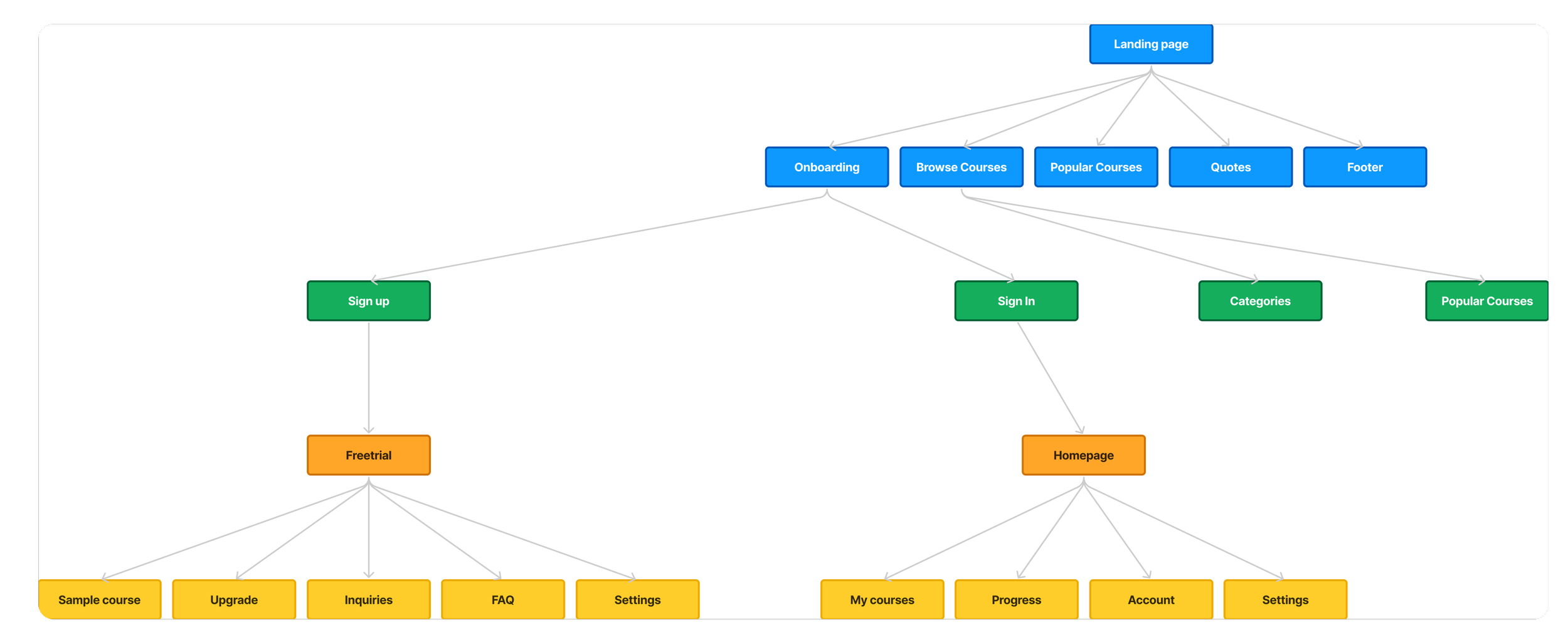
Site map prepared for the coming wireframes
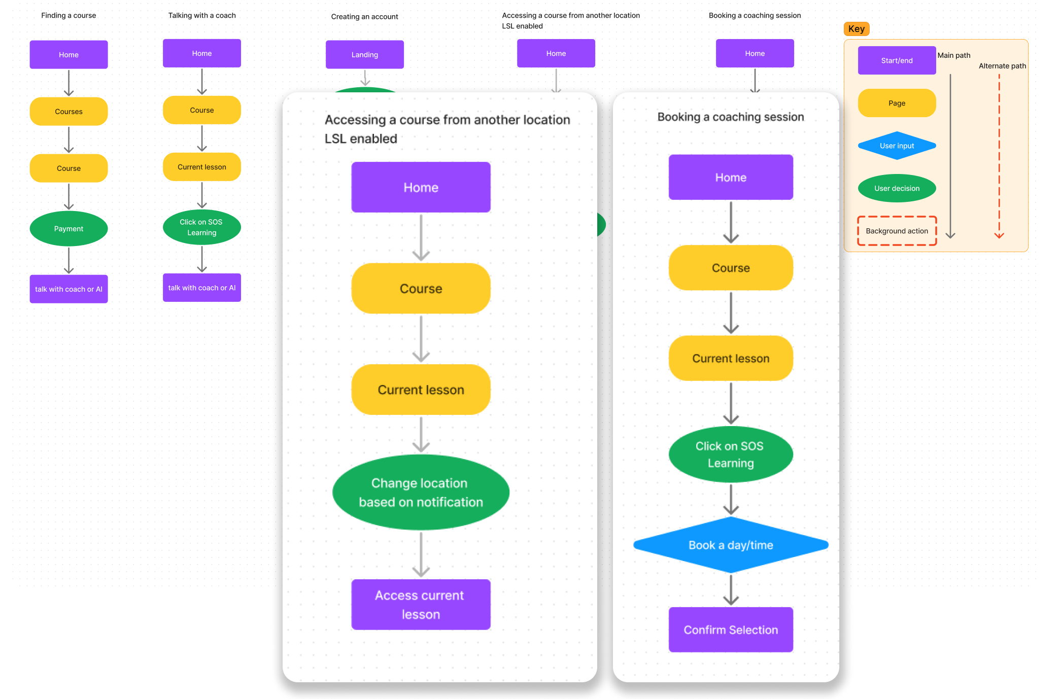
Task flows designed to complete the core objectives of this project
Ideate
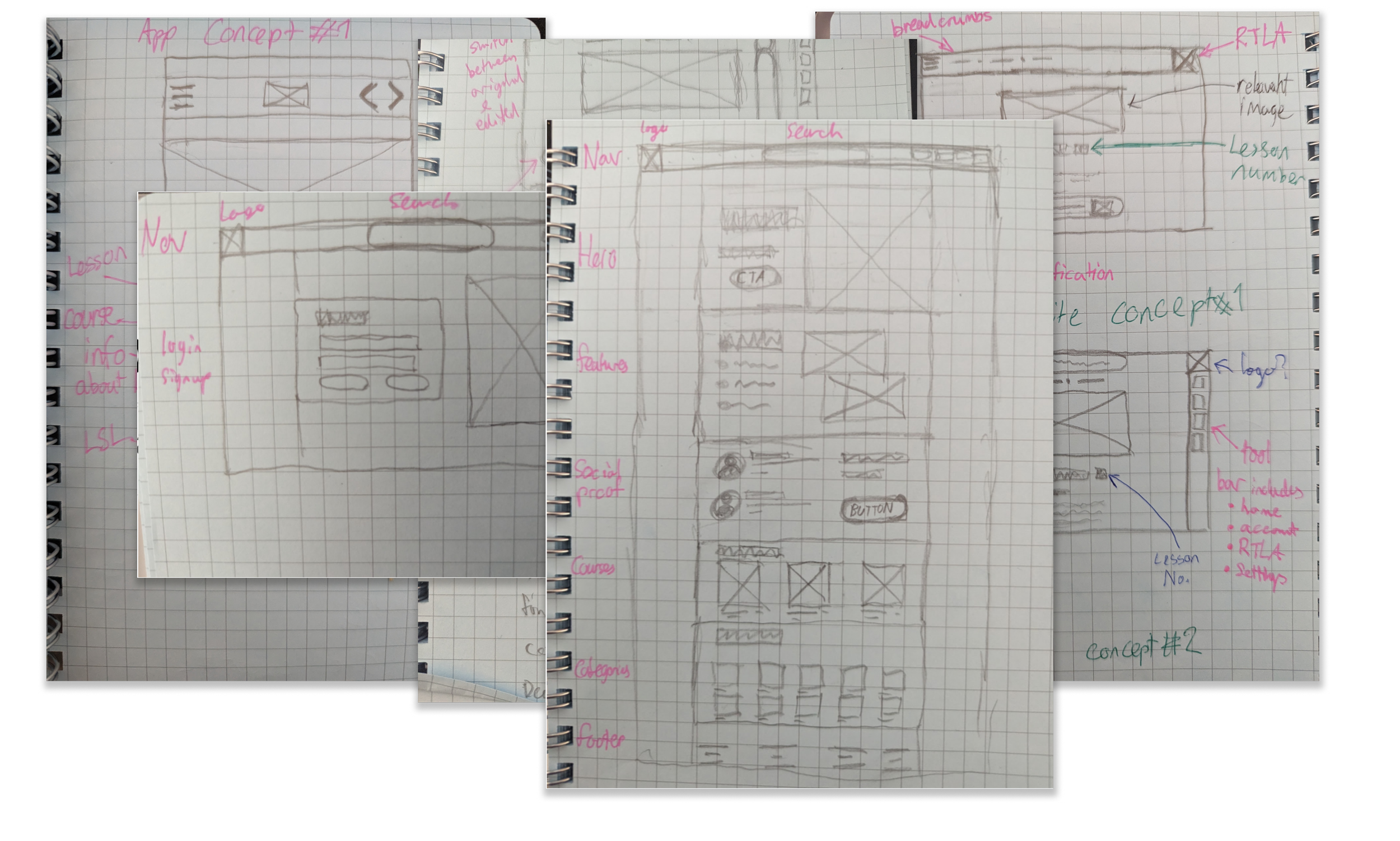
Low Fidelity Wireframing
I began sketching the wireframes I had blocked out by referring to the products’ competition, using these content blocks as an outline to guide my design decisions further.
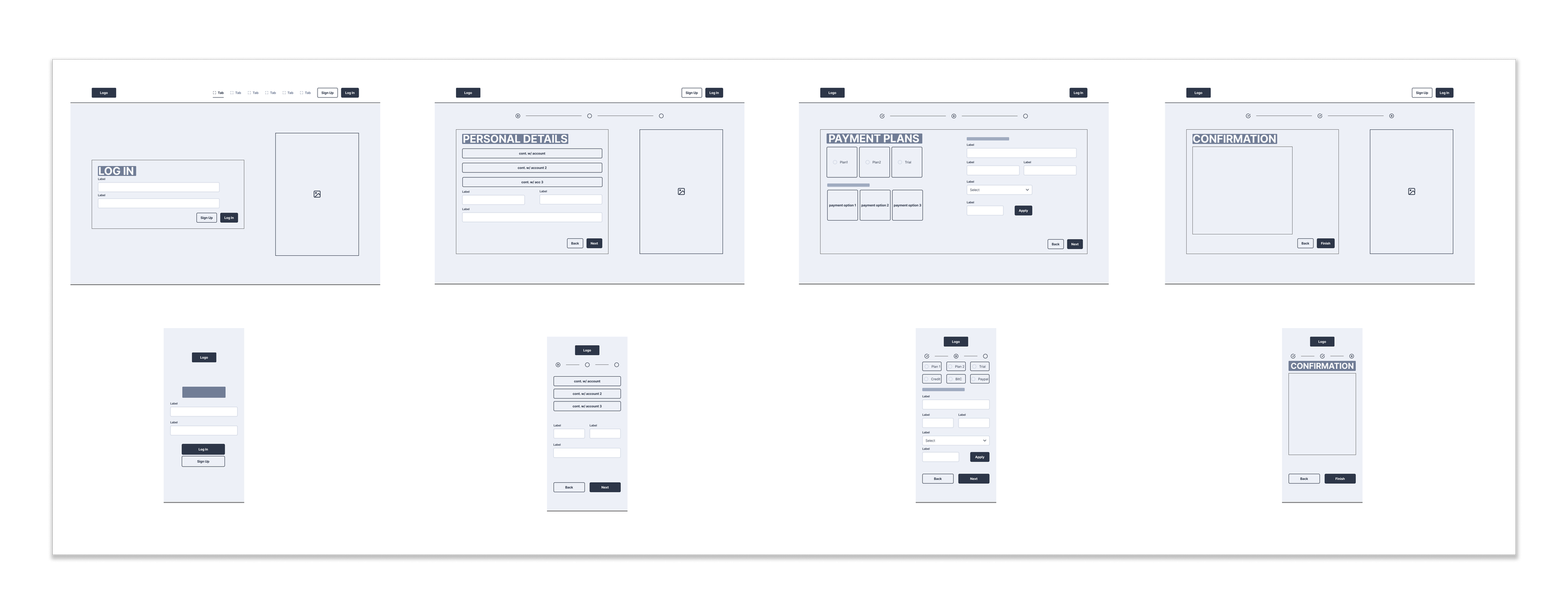
Mid-Fidelity Wireframing
Opting to make the mid-fidelity wireframes adaptive took much longer to create them but made the product much easier to visualise long-term as I decided to go mobile-first with the final product.
Brand Design
Brand values: Compassion, Student Focused, Distraction Free, Reliable, Community Driven
Colour?
Design
Using a green was a key decision due to the meaning behind the colour, and it's representing growth and promoting positive emotions when individuals achieve something.
I chose a dark mode style to further force the greens and blue to stand out from the other colours.
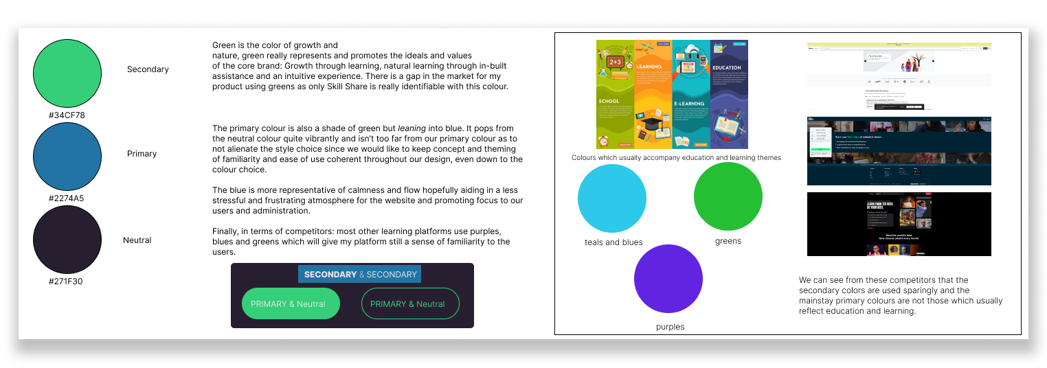
Research was conducted to assist the selection of appropriate colours for this project.
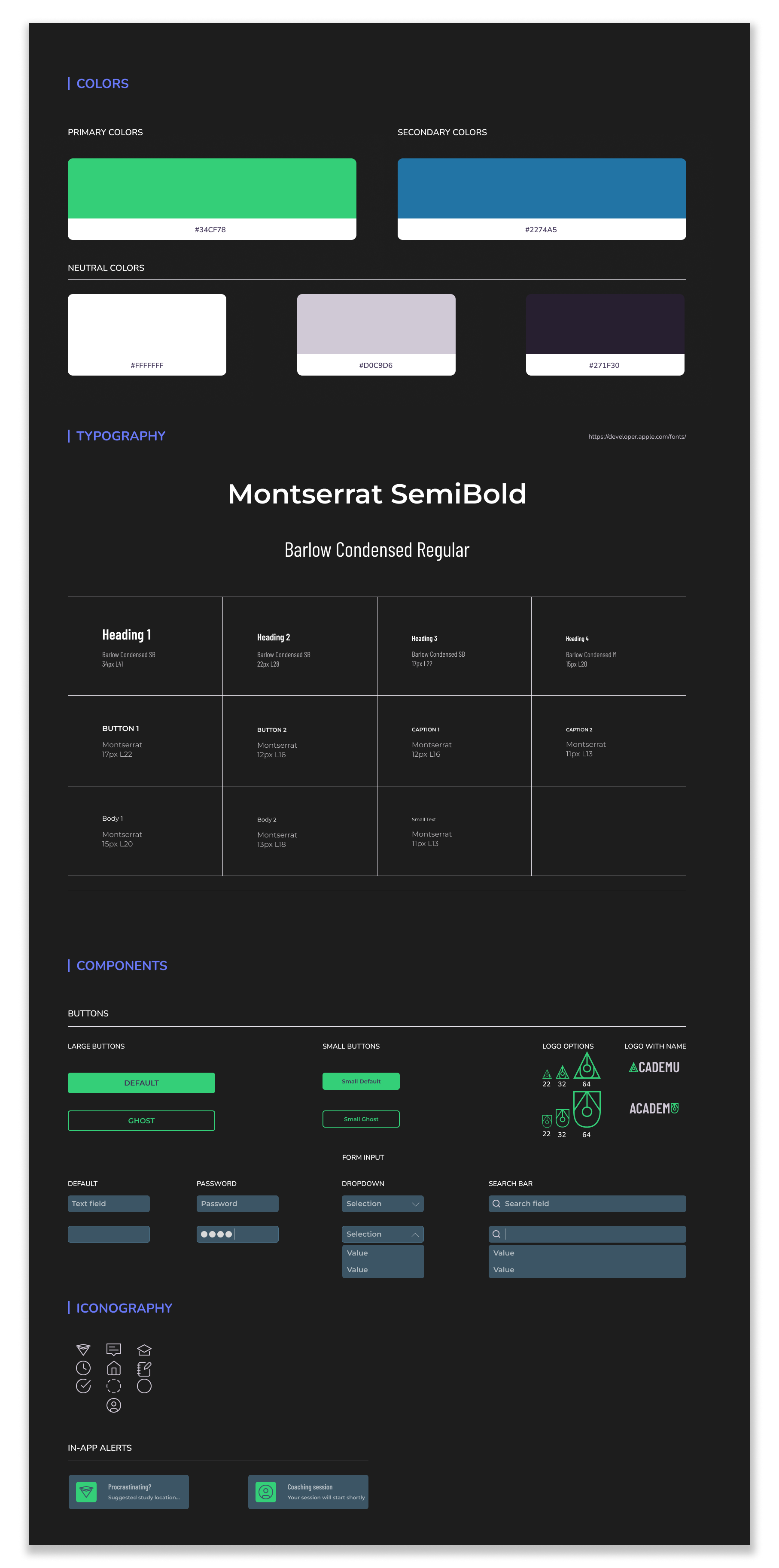

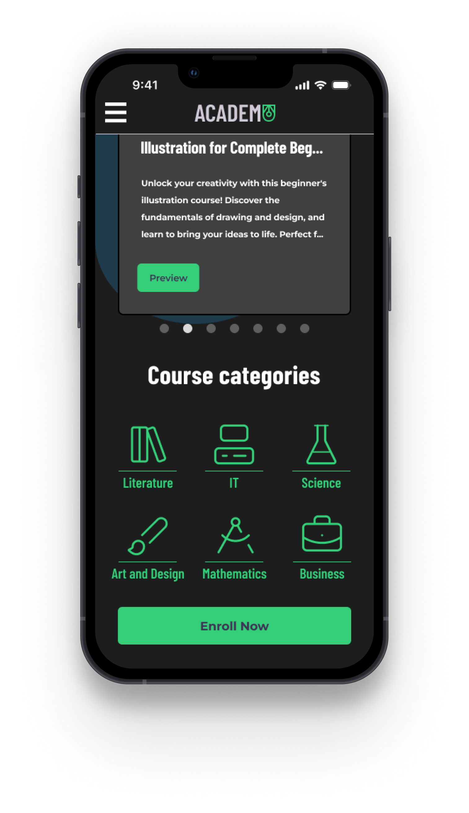
High Fidelity Designs
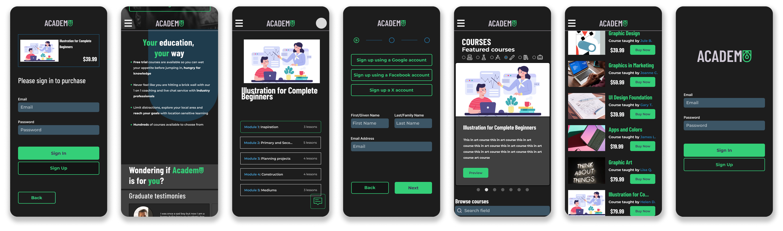
Utilizing the adaptive wireframes and my component set, the design was assembled as such to create a smooth, comprehensive and interactive experience for learners.
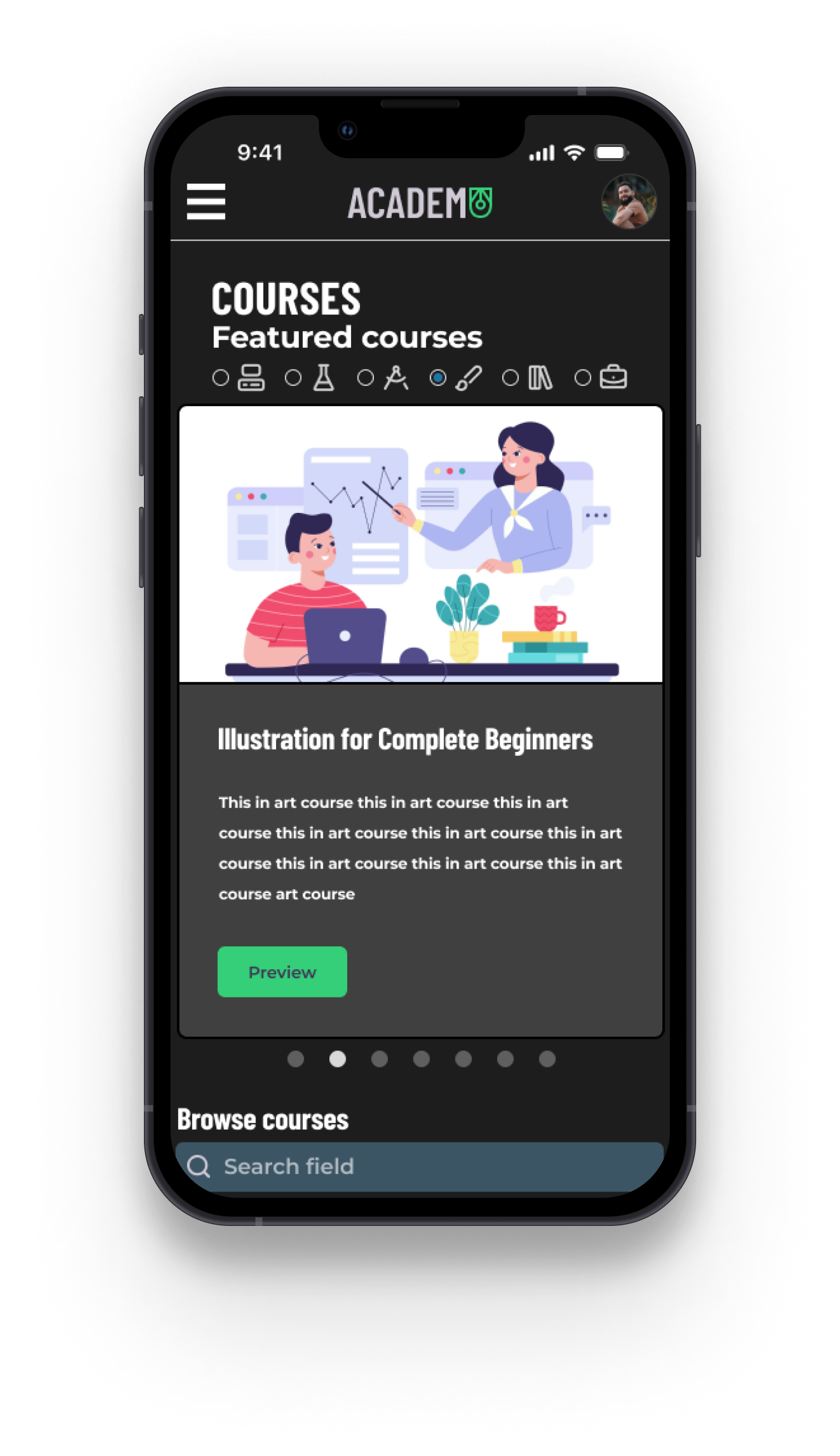
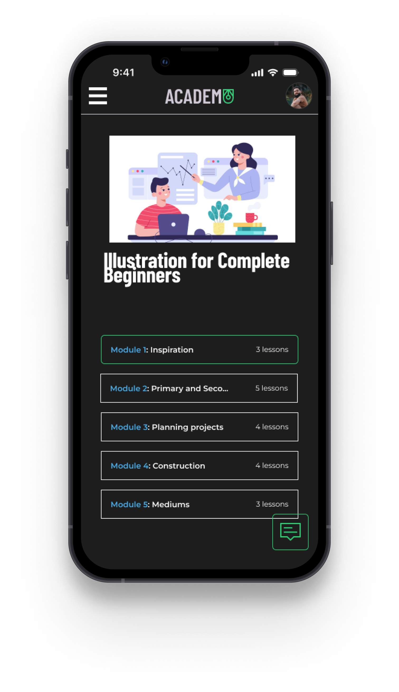
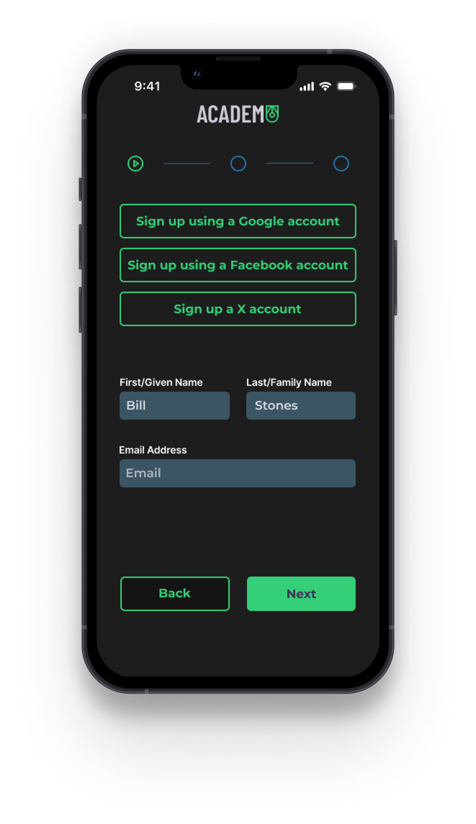
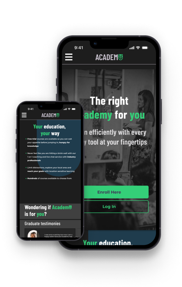
Screens Completed include:
A full homepage
A course page for two separate courses
Onboarding
Module selection and lesson page
An instant messenger for the module and lesson pages
Interaction Design
Before the design can be sent to potential users for testing, it needs to be responsive and feel as closely as the final product should feel.
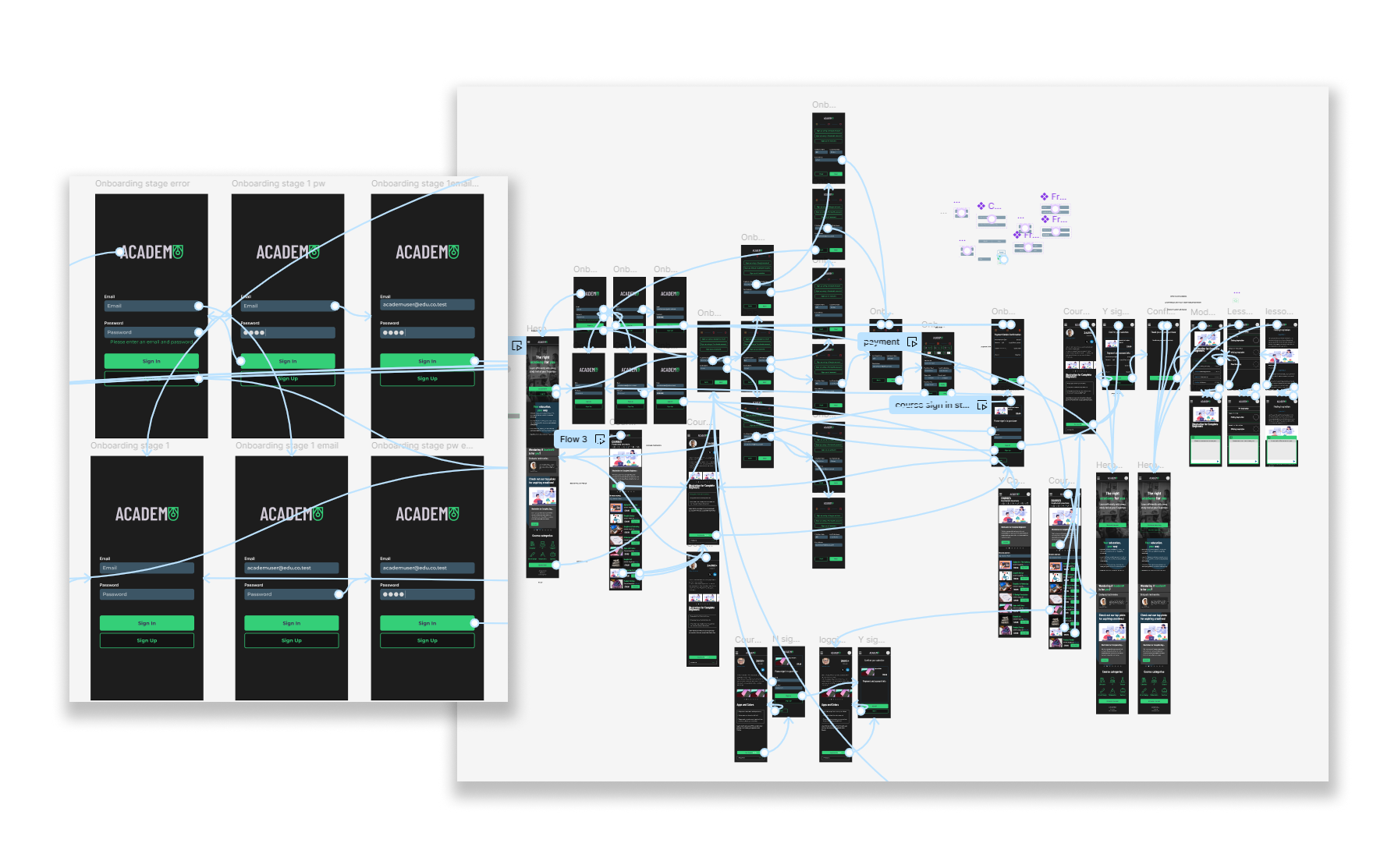
AcademU was built with the understanding that a user will want to create an account, navigate to the users’ desired course, continue to a lesson and have the ability to consult a live chat.
This is why we have so many moving parts and duplicate elements. Every line is an interaction to prevent dead ends and user error.
Usability testing
Number of Participants
Goals
Iterations
To expose weaknesses and pain points in the design
To understand a users’ exploration and navigation of the product
To gather feedback and improve the UI design
To monitor users’ interactions

5
Key Results

Confusion on the homepage on where to sign up
Accessibility concerns around the primary colour for the product
All users completed the requested tasks within the time given
Two dead ends were found
Placeholders were found to still be on some versions of pages

2 out of 5 users found dead ends
3 users expressed gratitude towards the ease of use and clarity of the product
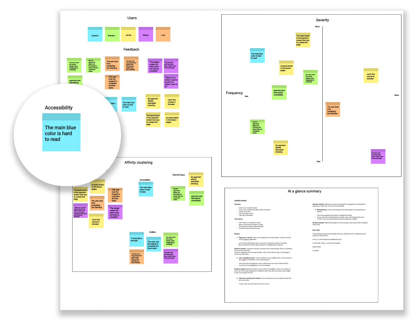
Through data synthesis, we can find categorize the priority of problems we need to solve. I have highlighted our most important but least time-consuming problem to solve in the figure above.
Improvements
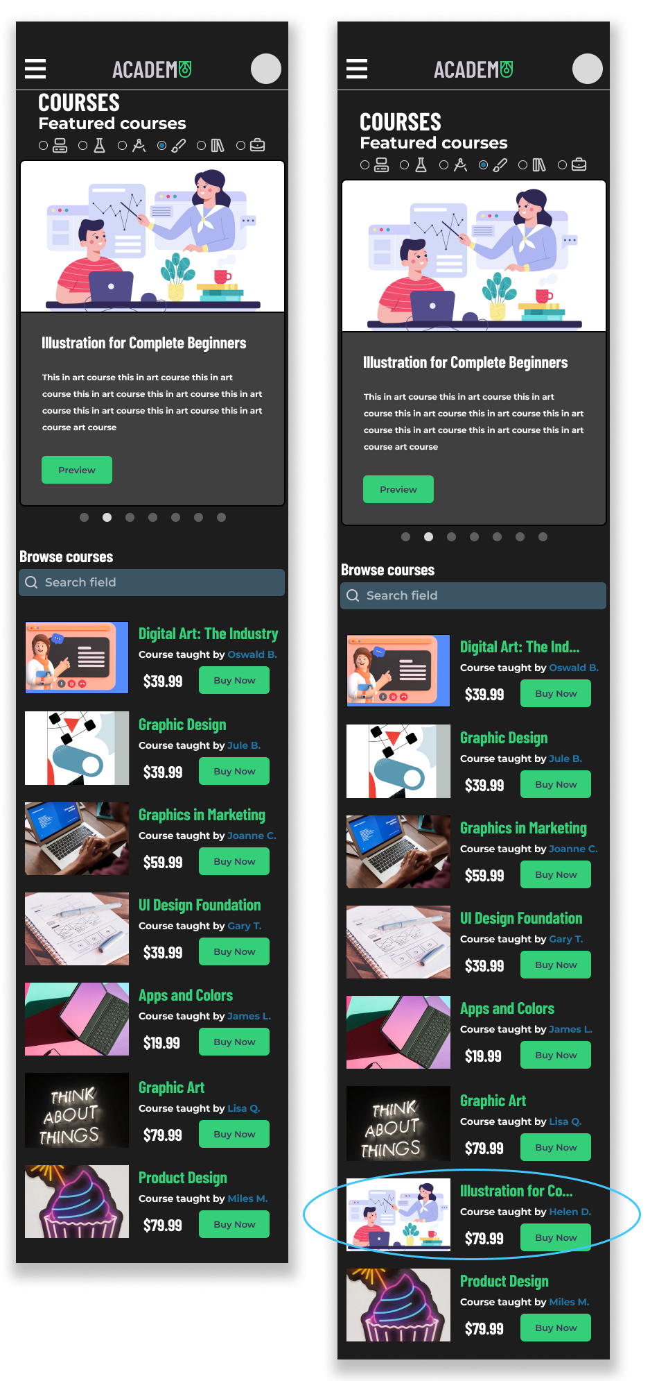
Improvement #1
Users were noticeably lost in the course browser when specifically asked to find the Illustration course, but it not being among the thumbnails under the featured section.
As a result, the course was added to the list and is fully functional.
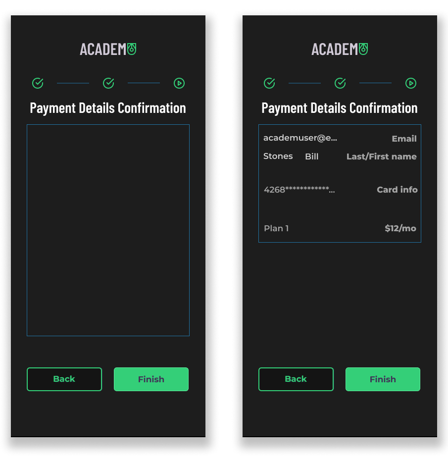
Improvement #2
2 of the 5 users pointed out placeholder screens, such as, the payment screens at the end of onboarding.
Here is the before and after of those screens being changed according to feedback.
Improvement #2
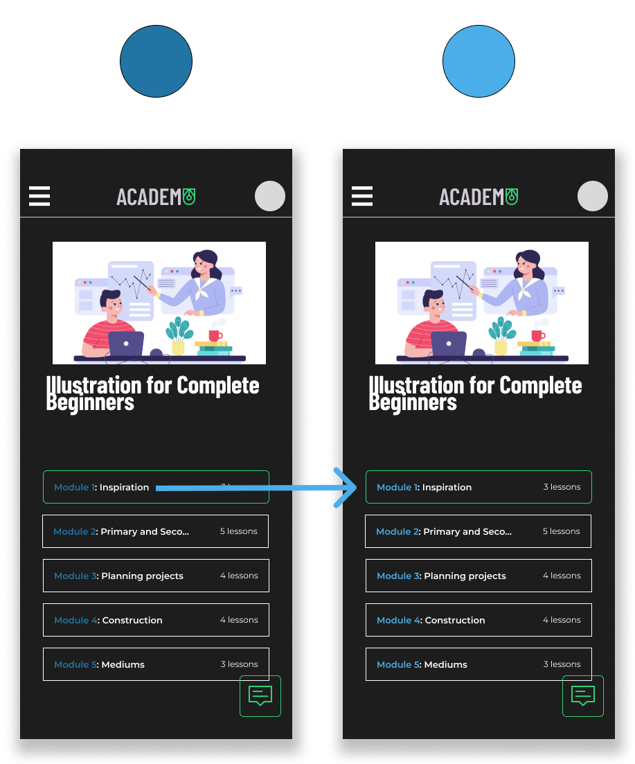
1 user expressed concern around the blue colour used as my primary colour in the products’ palette. As it was a minority problem, I decided to consult another designer and received similar feedback.
Here is a screen showing the drastic change in readability.
What I Learned
Time constraints can lead to cutting desired features
Project scope is a real constraint when under a deadline. As you can see from the final product, it lacks one major feature… That’s right! My solution to distractions when learning online is completely absent. The project became so bloated with ideas that I found out the hard way that features must be cut and deadlines must be made in order to push a product over the finish line into hand-off.
In the future, I hope to scale back on ideas to allow for more time in the other areas of the design process.
Final Thoughts
Humility and understanding the value of user feedback
The product will only speak for itself if others have tried it, and you have gone through all the tribulations of prototyping and testing. AcademU was a big stepping stone that allowed me as a designer to overcome a lot of anxiety when it comes to showing my unfinished, under polished work.
Next time, I would like to dedicate more time to fully fleshing out interviews with 1 to 5 scales and less leading questions. The same goes for post prototype testing interviews.
This project was my first jump into the research side of UX design, and there are many takeaways I wish to share with you.