
Updating and Modernizing
Joybox is a Japan-focused snack box subscription service that delivers unique flavor profiles to customers' doors every month.
Introduction
Background
Joybox is a local business offering subscription surprise boxes for those seeking a unique cultural taste of Japan. As a relatively new startup, it faces fierce competition from brands like “Bokksu” and “SakuraCo”.
The business owner is seeking a designer to reimagine the website with a more “modern” aesthetic to attract more clicks and increase page view time.
Project goals
The website must be fully responsive, ensuring a seamless experience across mobile and tablet devices.
Provide a vastly improved experience for users looking to purchase a subscription service from Joybox.
Completion time
2-month project completion
My role
User Experience Designer and Researcher
Tools

The Solution
Through my research, I designed an enhanced experience for future Joybox users, modernizing the website and improving its clarity and readability.
Research
Research Objectives
1. Determine what a subscription to the product accomplishes in daily life.
2. Understand how the site’s design alters the likelihood of a subscription.
3. Understand the process of subscribing and exploring the site’s many features.
4. Learn if there are triggering events.
Secondary Research
To gain a comprehensive understanding of the subscription box industry, I wanted to look beyond just the immediate competition. I also aimed to analyse other popular subscription box services to understand why those websites are successful at retaining users and converting them into customers.

Homepage is compact

You can subscribe from the homepage easily
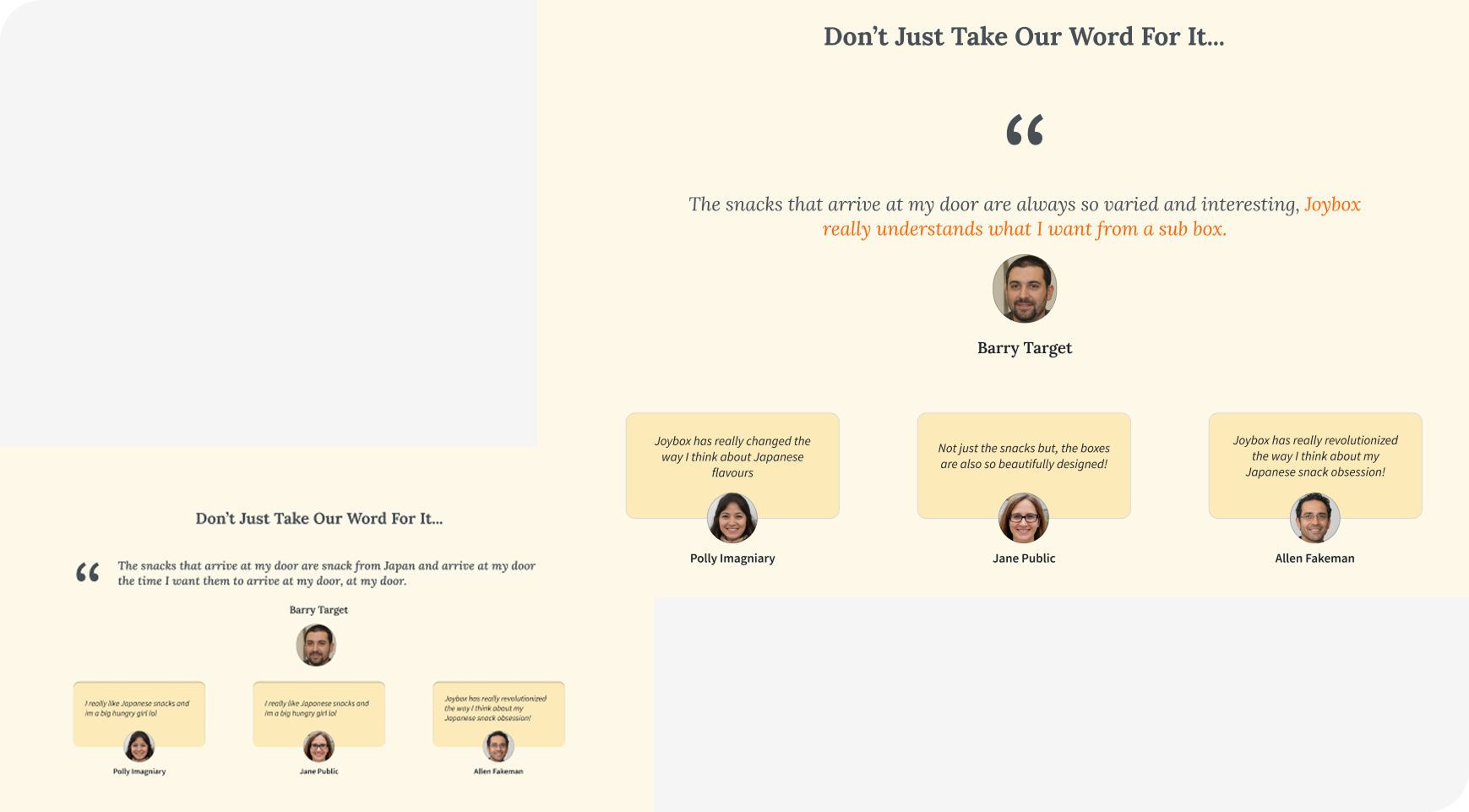
Testimonial takes up a whole screen


Social proof stands out and has a subsection of live updated gallery following its own hashtags
Very clear brand identity, every element feels on brand and immerses you in the purchase
Cannot subscribe from the homepage

Plenty of CTA’s encouraging you to join
The ability to buy the product from the homepage
Random non-purposeful PNG in middle of the screen
Primary Research
For this project, I gathered participants to interview for our primary research.
I interviewed 6 potential customers.
Interview Format
Firstly, after housekeeping, I asked general questions linked to subscription purchases
How do you feel about physical subscription packages?
I stay in quite a bit so I find the service really helpful!
The second step was getting the participants to use the current website
I can’t see what’s inside the box so I have no idea if I am getting my moneys worth.
What would turn you away from a subscription package like Joybox?
Finally, I got the participants to try some of our competitors sites
What would be a deciding factor to subscribe to a subscription package?
As I can see from these other products, I feel like the background and theming of the website has a large impact for me.
Affinity Mapping
I took all the answers I acquired from the interviews and whisked them up into a much easier to discern affinity map.

Here I identified that 3 of my participants’ motivations to become a customer is down to the clarity of purchase information and/or the cost of the product itself.
Since I have no control over the cost we can just put that reason to the side, but the contents not being visible is something interesting we play with later in this project.
Personas
I created two personas to represent the needs and wants of potential Joybox customers

Todd is a software engineer interested in learning about the cultural backgrounds behind the products he buys. Very well travelled and culturally conscious.

Cassie is a cashier, working with a low budget, she wants to know exactly what she is about to purchase.
Users are eager to purchase a Joybox to enjoy Japanese snacks and immerse themselves in Japanese culture from home. However, they are not subscribing to Joybox due to poor presentation of information, confusing navigation, and website structure. As a result, they are unable to explore all of Joybox's offerings to make an informed purchase decision.
Problem Statement
How Might We Questions
➢ How might we provide users with a simple and cohesive experience when purchasing a product from joy box so that they will have a positive experience and potentially recommend our products to other customers?
➢ How might we aid users with less confusing navigation and a more accessible experience when exploring the website?
➢ How might we turn the homepage into a narrative experience leading the user through the process of making the product so that they will have more confidence in their purchase later?
Ideate
The Vision
Task flows for this project are as follows

Mid-Fidelity Wireframing
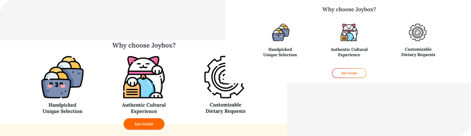
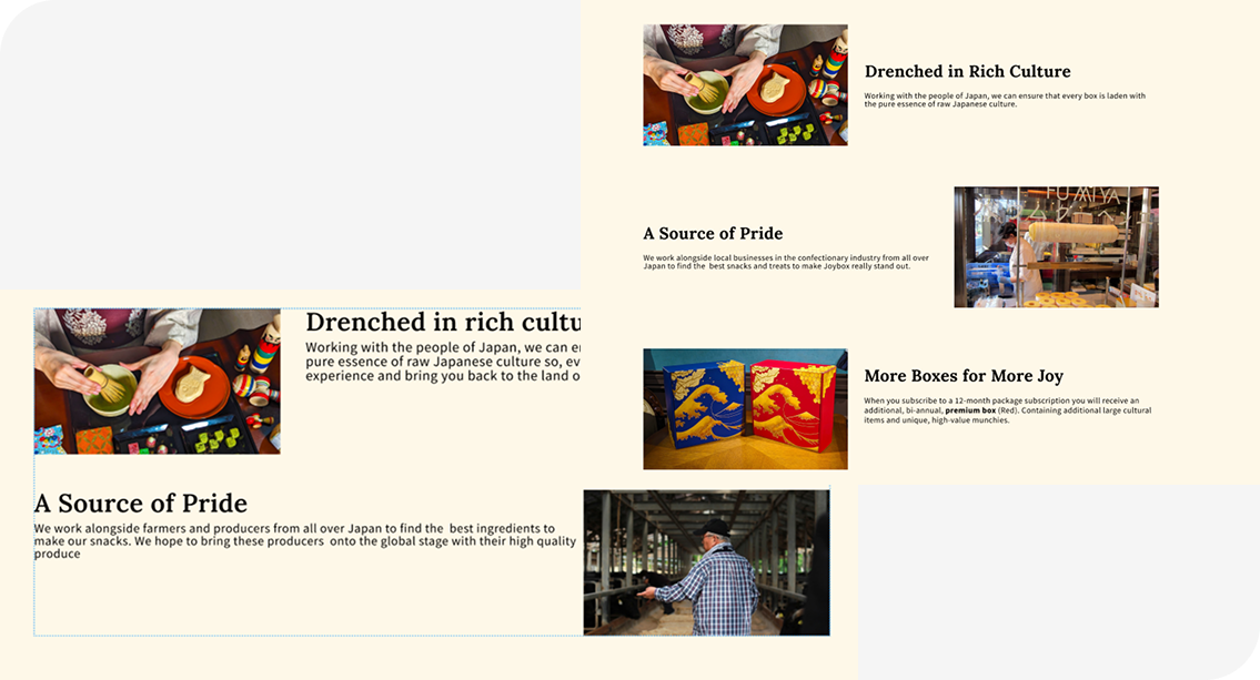
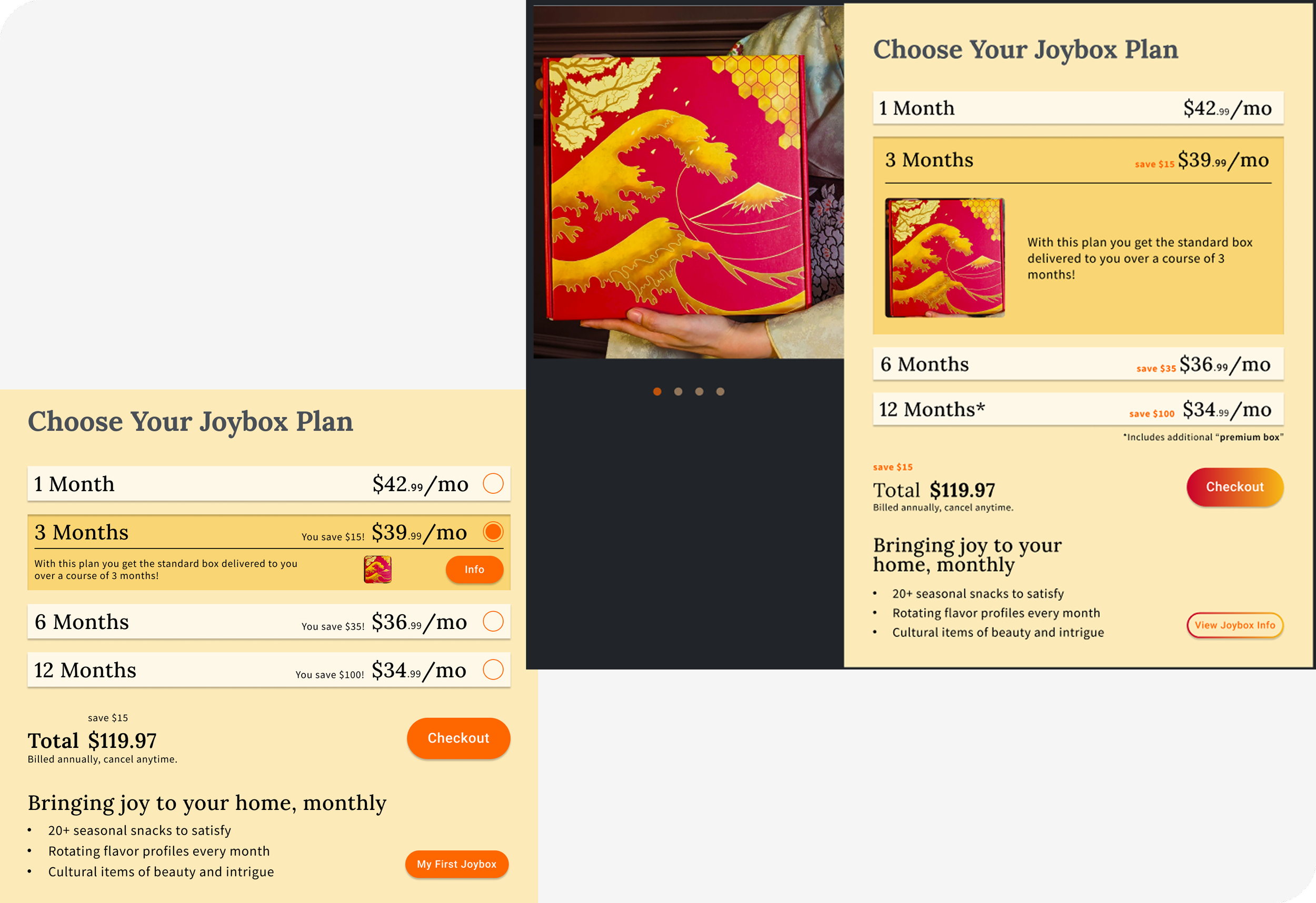
After discussing the wireframes with the client, I came up with these mid-fi representations of the new vision for the website.

Design
High Fidelity Designs


Features Completed include:
A full homepage

Product page
Revamp purchase portal on the homepage
Contents preview
Interaction Design
Before the design can be sent to potential users for testing, it needs to be responsive and feel as closely as the final product should feel.

The most important interactions that needed to be built for demonstration include:
Selection of product for purchase
Navigating to and from the home page and product page
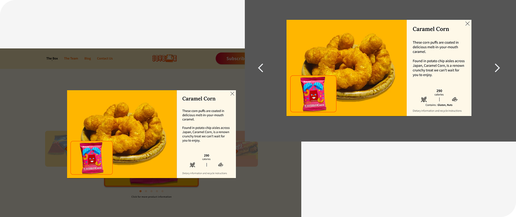
Viewing information about what is featured in the package
Iterations
Usability testing
Number of Participants

5
Goals
We want to match the user’s keywords that describe Jobox box as closely as possible with the client's ideal branding words
Gain as much insight as possible to make positive changes to the design
Ask questions that lead to measurable outcomes
Keyword Matching
Before the project began, we asked the client what Joybox meant to them and to describe their brand in 6 keywords:
Joyful, Delicious, Curiosity, Curated, Hand-picked, Community, Culture Rich
We then asked this question during our initial interviews and gain a colourful spectrum of keywords:
Warm, Dated, Japan, Multicultural, Boxes, Farmers, Heat, Pressure
When asked again we did not get the exact same keywords but they much more closely aligned with how the client perceived the brand:
Curious, Fanciful, Cultural Connection, Community, Collection, Joyful
Considering I did not give a list of keywords to choose from, the words chosen are very close to the brand identity the client imagined.
Key Results

Confusion about how to get home
Not realising they can click the carousel to get more info about the images
Knowledge about the premium box was very sparse even after the exploration phase of testing had concluded

I was able to gather a gargantuan amount of feedback to improve the design for the handoff
… Also, some very positive quotes
I still feel like I am looking at the same brand and product, but it feels a lot smoother to explore!
I think I might actually buy one of these when my next pay cheque comes through!
The website feels handcrafted and like professional product
Improvements
Improvement #1
A quick UI improvement was to frame the “pitch” icons to draw more attention to them, and adjust the location of the CTA on that section to be more accessible.
Improvement #2
I reduced the density of information around some of the info cards. A lot of user expressed that they would most likely just scroll past so much small text rather than read it.
Improvement #3
I adjusted the styles in the product purchase sections of the design to reflect a more obvious information hierarchy to improve information clarity. I also added addition information about the exclusive products, as most of my test participants couldn’t identify how or where to get the premium box.
Improvement #4
I added navigation arrows to the carousel. 3 of the test participants had no idea how to view other items.

Improvement #5
The testimonial section was formatted to be more consistent with clear visual hierachy.
Improvement #6
I added clearer allergen information and placed navigation arrows, as 2 people mentioned they clicked to the side of the modal to go to the next item.
Quick Side By Side
Old Homepage
(Desktop)

New Homepage
(Desktop)

Old Homepage
(Mobile)

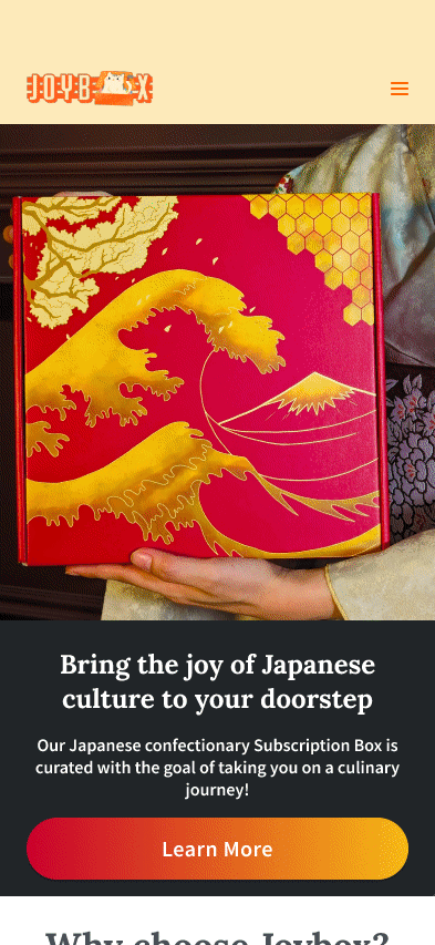
New Homepage
(Mobile)

Final Thoughts
This was the first real world I worked on that:
- I worked with a real world client
- My design had a real world impact
- I made a fully functioning responsive designed website… for the real world!
What I Learned
Justify, justify, JUSTIFY!
The project made me more conscious of the “why” in design over the creative “what”. At every client meeting I felt obligated to explain and give arguments to what I was changing and what the potential outcomes of these changes were with justification and evidence.
This really drilled home to why research and justification was so important, and not just the creative pen-to-paper moments of the process.
Experimentation kills time
I noticed in this project I tried to experiment with my creativity and to limit test my Figma skills.
What ended up happening was a lot of time loss due to miss match formatting and incorrect labelling where I had tunnel-visioned a mechanic I was not comfortable in implementing.