
Tracking and discouraging your smoking habit
Quit Tracker is a smoking cessation application specialising in its namesake: tracking your habits and providing smokers with support to quit altogether.
Introduction
Background
Smoking remains deeply ingrained in modern culture, and many individuals continue to struggle with quitting despite the availability of various methods. Governments are investing in mobile apps and enforcing restrictions worldwide to prevent future generations from starting the habit.
Project goals
The platform must have a way to track daily smoking habits
Users need a way to access support when going through a craving
Completion time
9 weeks
My role
UX/UI, Branding, Research
Tools

The Solution
Through secondary research, I angled my design focus into an application that focuses on data collection and tracking while adapting the most successful features discovered in interviews.
Research
Research Objectives
1. Identify and understand the demographic for our cessation app
2. Understand how people will comfortably use our service
4. Determine how users quit using these apps
Secondary Research
I researched both smoking cessation apps and general habit trackers to understand their features and visual design expectations.

Very easy to read iconography

Straight forward habit assignment
Very limited featureset

Progress encouraged completing modules like a course
Chat for help
No community

Community section for encouragement
Detailed statistics
Less features than competition
Others


User Interviews
I interviewed 6 smokers.
5 participants have used cessation apps in the past.
1 participant had no interest in quitting.
1 participant found success through a competitor.
Key quotes
Here are some notable quotes from the interviews
Quit Genius motivated me, too intense. Smoke free easier to use but didnt keep me interested
How effective were smoking cessation apps?
Quitnow, tracks progress, too frequesnt notifications, too much generic advise
Quitnow somewhat helpful, tracks progress, not enough personalisation. smoke free was too generic
Would you be inclined to open an app regularly to track your smoking habit?
If I could see measurable progress, like how many days ive gone without smoking, yes
Yes, especially if its easy to use and gives me daily updates
Yes I checked QuitSure app daily to track my milestones
What would incentivise you to regularly use an app and stick to quitting your habit?
Seeing my progress daily, earning rewards, and getting support through the app were all motivating factors for me
Seeing my progress daily,and getting support
Making Order from Chaos

We discovered that huge motivators to get people on the app were stats and rewards, but to retain users we need a way to hold our smokers accountable for their cessation journey.
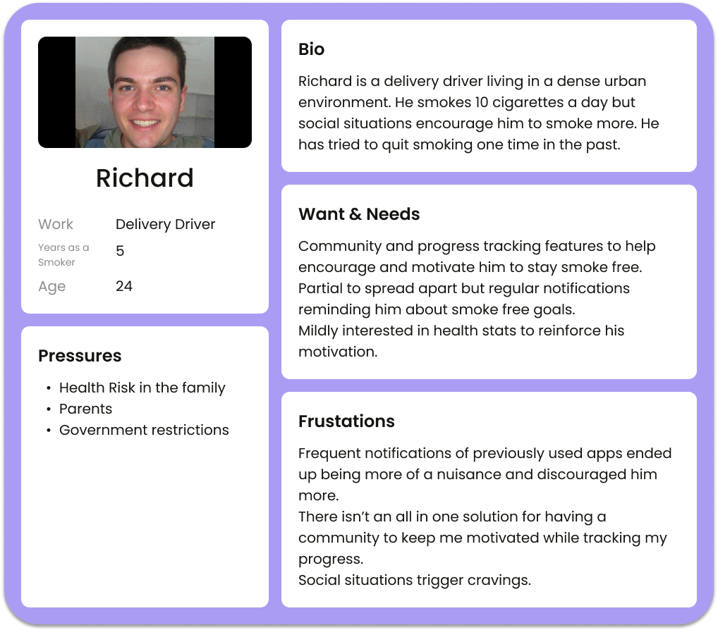
Who Are Our Users?
These two personas capture the needs of our quitting smokers we collected throughout our research, making our life so much easier designing later.
Point Of View Statements
★ I would like to explore ways to help struggling smokers keep on target and quit the habit because having a craving with no outlet for support can cause a relapse.
★ I would like to improve the online cessation space by providing smokers a way to accurately track their habit and define their actionable steps moving forward because a big reason people go to these apps is to keep on top of stats.

How Might We Questions
➢ How might we create a safe environment to help recovering smokers quit?
➢ How might we limit potential triggers when building our design?
➢ How might we help keep users motivated to keep using our app during their cessation period?
➢ How might we assist those who are motivated by stats and numerical results?
➢ How might we provide a space to aid those who are struggling to quit?
The Vision

The original site map has some inconsistencies with the final design you will see later, after the iteration process.
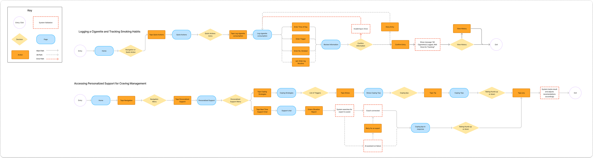
These are the two major features I decided to implement into the design.
Logging a cigarette should be accessible almost anywhere on the app, but I later had a change of heart over some modernizing design decisions.
Asking for help shouldn’t be demonstrated in just one feature so I decided to design two separate features for this action.
Ideate
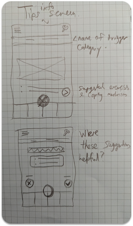
Paper Wireframes


Mid-Fidelity Wireframing

This is the first iteration of the mid-fi designs. I really tried to only highlight the user flows with this first version.
Time For A Test

3 participants joined the usability test
Goals
Navigation and exploration of the application makes sense within the 10-min allotted timeframe.
Key features are straightforward and intuitive. (Participants will not need to ask questions about features that are intuitive and feel familiar.)
The layout is pleasant and assists in the navigation of the app.
Key Results

Confusion completing tasks and requires tutorial
2 users mentioned it takes too many clicks to log a cigarette
Clock asset is too big and distracting and looks “dated”

All users completed the requested tasks within the time give
All users reacted positively to the features
Mid-Fidelity Iteration
Design
Brand Design
Brand values: Promote recovery, Calm vibe, Stats and Actionability
Colour?

Purple is the colour of recovery, courage and compassion, so I really wanted to get a nice deep, readable purple for our primary colour.
As you can see, the palette is large and varied to begin with. This changes as the project continues, but I wanted to keep an open mind thinking about greens for growth and acceptance with blues for learning and support.
Scrappy Boards

I created a mood board to set my thoughts and ideas of the brand identity onto a clear plane.
Logo Design
When it came to logo’s I tried to incorporate a lot of different themes to help shape as iconic and unique an image as possible.


These are the 3 core designs I digitized.
They encompass all the values I want to portray in our app.

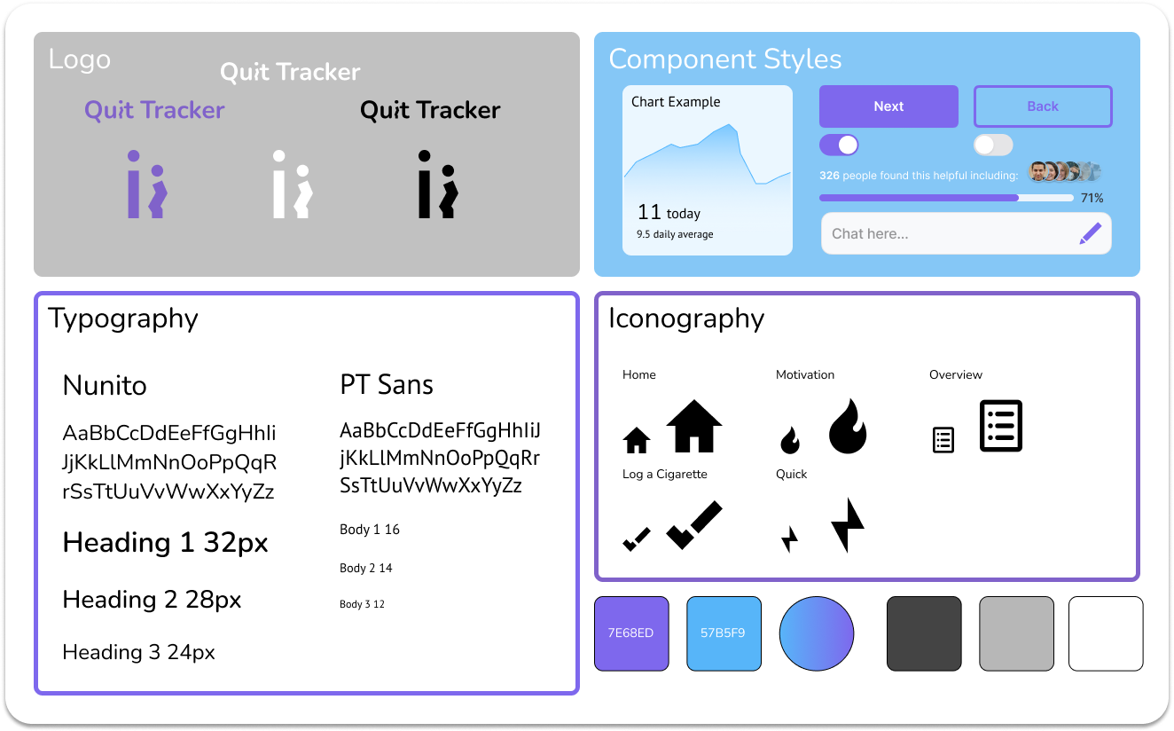
Components and Styles
You may find some discrepancies with the first iterations and this style tile. I went back to this and updated it for ease of use, for some of the sheet.
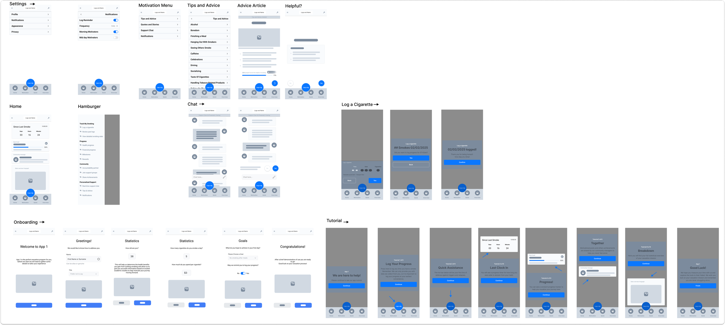
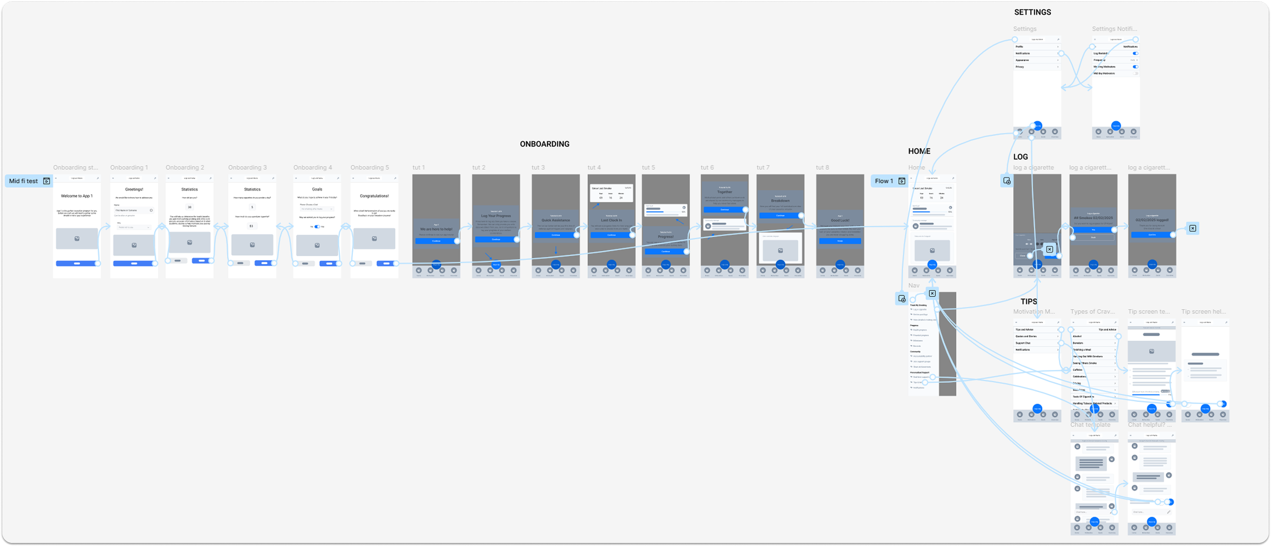
High Fidelity Designs


Utilizing the adaptive wireframes and my component set, the design was assembled as such to create a smooth, comprehensive and interactive experience for learners.
Screens Completed include:
Onboarding

Tutorial
Home
Menu’s to access all user flow features
Notification settings
Hamburger Menu
3 Tips and Advice articles
Instant messenger demonstration
Log a cigarette
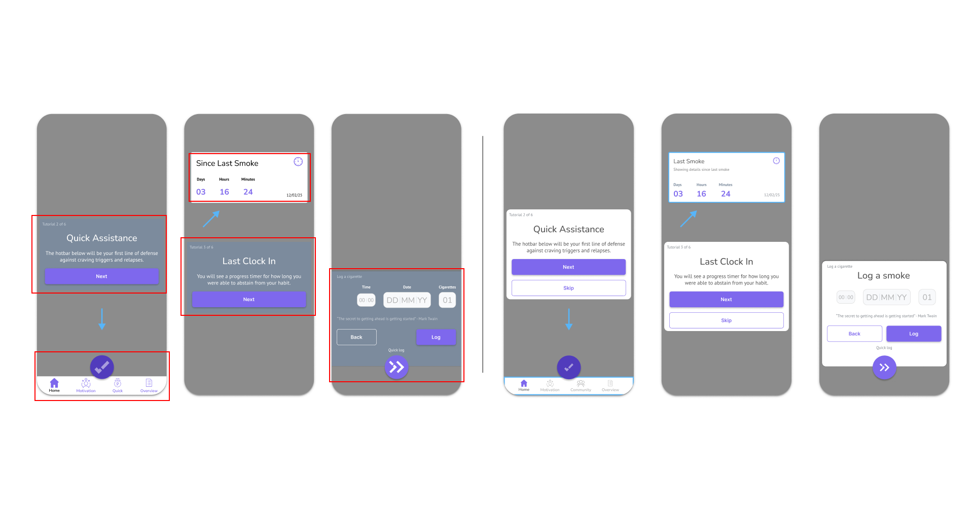
Interaction Design
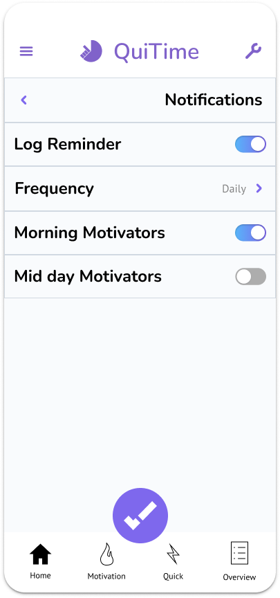
Before the design can be sent to potential users for testing, it needs to be responsive and feel as closely as the final product should feel.
Quit Tracker was built with the understanding that a user should be able to log their stats intuitively and immediately after getting acquainted with the system.
We have so many moving parts in the second image because I want to immerse the testers in the prototype and feel like they are trying an app that will help them beat their habit right out of the gate.

Iterations
Usability testing
Number of Participants
3
Goals
Gain as much insight as possible to make positive changes to the design
Ask questions that lead to measurable outcomes
Key Results
2 users found the hamburger menu too busy
All users completed the requested tasks within the time given
All users noted key improvements in the experience design of the Log a Cigarette function.
Accessibility concerns for the icons (colours)
Tips and advice felt too big for some users
Improvements
Core Improvements
The improvements were so numerous and drastic from the testing session, here is a short breakdown of the major changes:
The brand name and logo were changed from QuiTime to Quit Tracker
Icons changed to be consistent throughout (theme, size, colour, density)
Primary colour usage stripped back to necessity only
Tips no longer have a separate page for feedback
Tips no longer larger than a single screen size
All modals look consistent
Float buttons adjusted
Bottom menu total revamped for greater accessibility
Onboarding was shortened and left more concise
Top bar revamped to only be fully visible when needed
Every UI component now consistent with one another
Weight of some UI elements adjusted accordingly

Final Thoughts
What I Learned
Form with Function
When designing a product (or features for one), the look is a valuable as the feel of said product. With Quit Tracker, I had so much feedback on the look of the product because my efforts were not equal for both properties. When iterating, I learnt to solve this issue.

Observation is sometimes more valuable
During testing, I noticed participants actions and how they answered questions didn’t really match up. One participant was overjoyed how easy the process was and rated my Tips and Advice of navigation highly yet had no clue how to get back to the menu and clicked around frantically.
The project showed me I can use someone’s actions to improve a product and not only their words.

This was my big jump from working with a real client to working on a personal project and applying that knowledge.